Jobs & Careers
How to Combine Streamlit, Pandas, and Plotly for Interactive Data Apps

Image by Author | ChatGPT
Introduction
Creating interactive web-based data dashboards in Python is easier than ever when you combine the strengths of Streamlit, Pandas, and Plotly. These three libraries work seamlessly together to transform static datasets into responsive, visually engaging applications — all without needing a background in web development.
However, there’s an important architectural difference to understand before we begin. Unlike libraries such as matplotlib or seaborn that work directly in Jupyter notebooks, Streamlit creates standalone web applications that must be run from the command line. You’ll write your code in a text-based IDE like VS Code, save it as a .py file, and run it using streamlit run filename.py. This shift from the notebook environment to script-based development opens up new possibilities for sharing and deploying your data applications.
In this hands-on tutorial, you’ll learn how to build a complete sales dashboard in two clear steps. We’ll start with core functionality using just Streamlit and Pandas, then enhance the dashboard with interactive visualizations using Plotly.
Setup
Install the required packages:
pip install streamlit pandas plotly
Create a new folder for your project and open it in VS Code (or your preferred text editor).
Step 1: Streamlit + Pandas Dashboard
Let’s start by building a functional dashboard using just Streamlit and Pandas. This demonstrates how Streamlit creates interactive web interfaces and how Pandas handles data filtering.
Create a file called step1_dashboard_basic.py:
import streamlit as st
import pandas as pd
import numpy as np

# Page config
st.set_page_config(page_title="Basic Sales Dashboard", layout="wide")

# Generate sample data
np.random.seed(42)
df = pd.DataFrame({
    'Date': pd.date_range('2024-01-01', periods=100),
    'Sales': np.random.randint(500, 2000, size=100),
    'Region': np.random.choice(['North', 'South', 'East', 'West'], size=100),
    'Product': np.random.choice(['Product A', 'Product B', 'Product C'], size=100)
})

# Sidebar filters
st.sidebar.title('Filters')
regions = st.sidebar.multiselect('Select Region', df['Region'].unique(), default=df['Region'].unique())
products = st.sidebar.multiselect('Select Product', df['Product'].unique(), default=df['Product'].unique())

# Filter data
filtered_df = df[(df['Region'].isin(regions)) & (df['Product'].isin(products))]

# Display metrics
col1, col2, col3 = st.columns(3)
col1.metric("Total Sales", f"${filtered_df['Sales'].sum():,}")
col2.metric("Average Sales", f"${filtered_df['Sales'].mean():.0f}")
col3.metric("Records", len(filtered_df))

# Display filtered data
st.subheader("Filtered Data")
st.dataframe(filtered_df)
Let’s break down the key Streamlit methods used here:
- st.set_page_config() configures the browser tab title and layout
- st.sidebar creates the left navigation panel for filters
- st.multiselect() generates dropdown menus for user selections
- st.columns() creates side-by-side layout sections
- st.metric() displays large numbers with labels
- st.dataframe() renders interactive data tables
These methods automatically handle user interactions and trigger app updates when selections change.
Run this from your terminal (or VS Code’s integrated terminal):
streamlit run step1_dashboard_basic.py
Your browser will open to http://localhost:8501 showing an interactive dashboard.

Try changing the filters in the sidebar — watch how the metrics and data table update automatically! This demonstrates the reactive nature of Streamlit combined with Pandas’ data manipulation capabilities.
Step 2: Add Plotly for Interactive Visualizations
Now let’s enhance our dashboard by adding Plotly’s interactive charts. This shows how all three libraries work together seamlessly. Let’s create a new file and call it step2_dashboard_plotly.py:
import streamlit as st
import pandas as pd
import plotly.express as px
import numpy as np

# Page config
st.set_page_config(page_title="Sales Dashboard with Plotly", layout="wide")

# Generate data
np.random.seed(42)
df = pd.DataFrame({
    'Date': pd.date_range('2024-01-01', periods=100),
    'Sales': np.random.randint(500, 2000, size=100),
    'Region': np.random.choice(['North', 'South', 'East', 'West'], size=100),
    'Product': np.random.choice(['Product A', 'Product B', 'Product C'], size=100)
})

# Sidebar filters
st.sidebar.title('Filters')
regions = st.sidebar.multiselect('Select Region', df['Region'].unique(), default=df['Region'].unique())
products = st.sidebar.multiselect('Select Product', df['Product'].unique(), default=df['Product'].unique())

# Filter data
filtered_df = df[(df['Region'].isin(regions)) & (df['Product'].isin(products))]

# Metrics
col1, col2, col3 = st.columns(3)
col1.metric("Total Sales", f"${filtered_df['Sales'].sum():,}")
col2.metric("Average Sales", f"${filtered_df['Sales'].mean():.0f}")
col3.metric("Records", len(filtered_df))

# Charts
col1, col2 = st.columns(2)

with col1:
    fig_line = px.line(filtered_df, x='Date', y='Sales', color="Region", title="Sales Over Time")
    st.plotly_chart(fig_line, use_container_width=True)

with col2:
    region_sales = filtered_df.groupby('Region')['Sales'].sum().reset_index()
    fig_bar = px.bar(region_sales, x='Region', y='Sales', title="Total Sales by Region")
    st.plotly_chart(fig_bar, use_container_width=True)

# Data table
st.subheader("Filtered Data")
st.dataframe(filtered_df)
Run this from your terminal (or VS Code’s integrated terminal):
streamlit run step2_dashboard_plotly.py
Now you have a complete interactive dashboard!

The Plotly charts are fully interactive — you can hover over data points, zoom in on specific time periods, and even click legend items to show/hide data series.
How the Three Libraries Work Together
This combination is powerful because each library handles what it does best:
Pandas manages all data operations:
- Creating and loading datasets
- Filtering data based on user selections
- Aggregating data for visualizations
- Handling data transformations
Streamlit provides the web interface:
- Creates interactive widgets (multiselect, sliders, etc.)
- Automatically reruns the entire app when users interact with widgets
- Handles the reactive programming model
- Manages layout with columns and containers
Plotly creates rich, interactive visualizations:
- Charts that users can hover, zoom, and explore
- Professional-looking graphs with minimal code
- Automatic integration with Streamlit’s reactivity
Key Development Workflow
The development process follows a straightforward pattern. Start by writing your code in VS Code or any text editor, saving it as a .py file. Next, run the application from your terminal using streamlit run filename.py, which opens your dashboard in a browser at http://localhost:8501. As you edit and save your code, Streamlit automatically detects changes and offers to rerun the application. Once you’re satisfied with your dashboard, you can deploy it using Streamlit Community Cloud to share with others.
Next Steps
Try these enhancements:
Add real data:
# Replace sample data with CSV upload
uploaded_file = st.sidebar.file_uploader("Upload CSV", type="csv")
if uploaded_file:
    df = pd.read_csv(uploaded_file)
Keep in mind that real datasets will require preprocessing steps specific to your data structure. You’ll need to adjust column names, handle missing values, and modify the filter options to match your actual data fields. The sample code provides a template, but each dataset will have unique requirements for cleaning and preparation.
More chart types:
# Pie chart for product distribution
fig_pie = px.pie(filtered_df, values="Sales", names="Product", title="Sales by Product")
st.plotly_chart(fig_pie)
You can leverage an entire gallery of Plotly’s graphing capabilities.
Deploying Your Dashboard
Once your dashboard is working locally, sharing it with others is straightforward through Streamlit Community Cloud. First, push your code to a public GitHub repository, making sure to include a requirements.txt file listing your dependencies (streamlit, pandas, plotly). Then visit https://streamlit.io/cloud, sign in with your GitHub account, and select your repository. Streamlit will automatically build and deploy your app, providing a public URL that anyone can access. The free tier supports multiple apps and handles reasonable traffic loads, making it perfect for sharing dashboards with colleagues or showcasing your work in a portfolio.
Conclusion
The combination of Streamlit, Pandas, and Plotly transforms data analysis from static reports into interactive web applications. With just two Python files and a handful of methods, you’ve built a complete dashboard that rivals expensive business intelligence tools.
This tutorial demonstrates a significant shift in how data scientists can share their work. Instead of sending static charts or requiring colleagues to run Jupyter notebooks, you can now create web applications that anyone can use through a browser. The transition from notebook-based analysis to script-based applications opens new opportunities for data professionals to make their insights more accessible and impactful.
As you continue building with these tools, consider how interactive dashboards can replace traditional reporting in your organization. The same principles you’ve learned here scale to handle real datasets, complex calculations, and sophisticated visualizations. Whether you’re creating executive dashboards, exploratory data tools, or client-facing applications, this three-library combination provides a solid foundation for professional data applications.
Born in India and raised in Japan, Vinod brings a global perspective to data science and machine learning education. He bridges the gap between emerging AI technologies and practical implementation for working professionals. Vinod focuses on creating accessible learning pathways for complex topics like agentic AI, performance optimization, and AI engineering. He focuses on practical machine learning implementations and mentoring the next generation of data professionals through live sessions and personalized guidance.


Image by Author | Gemini (nano-banana self portrait)
# Introduction
Image generation with generative AI has become a widely used tool for both individuals and businesses, allowing them to instantly create their intended visuals without needing any design expertise. Essentially, these tools can accelerate tasks that would otherwise take a significant amount of time, completing them in mere seconds.
With the progression of technology and competition, many modern, advanced image generation products have been released, such as Stable Diffusion, Midjourney, DALL-E, Imagen, and many more. Each offers unique advantages to its users. However, Google recently made a significant impact on the image generation landscape with the release of Gemini 2.5 Flash Image (or nano-banana).
Nano-banana is Google’s advanced image generation and editing model, featuring capabilities like realistic image creation, multiple image blending, character consistency, targeted prompt-based transformations, and public accessibility. The model offers far greater control than previous models from Google or its competitors.
This article will explore nano-banana’s ability to generate and edit images. We will demonstrate these features using the Google AI Studio platform and the Gemini API within a Python environment.
Let’s get into it.
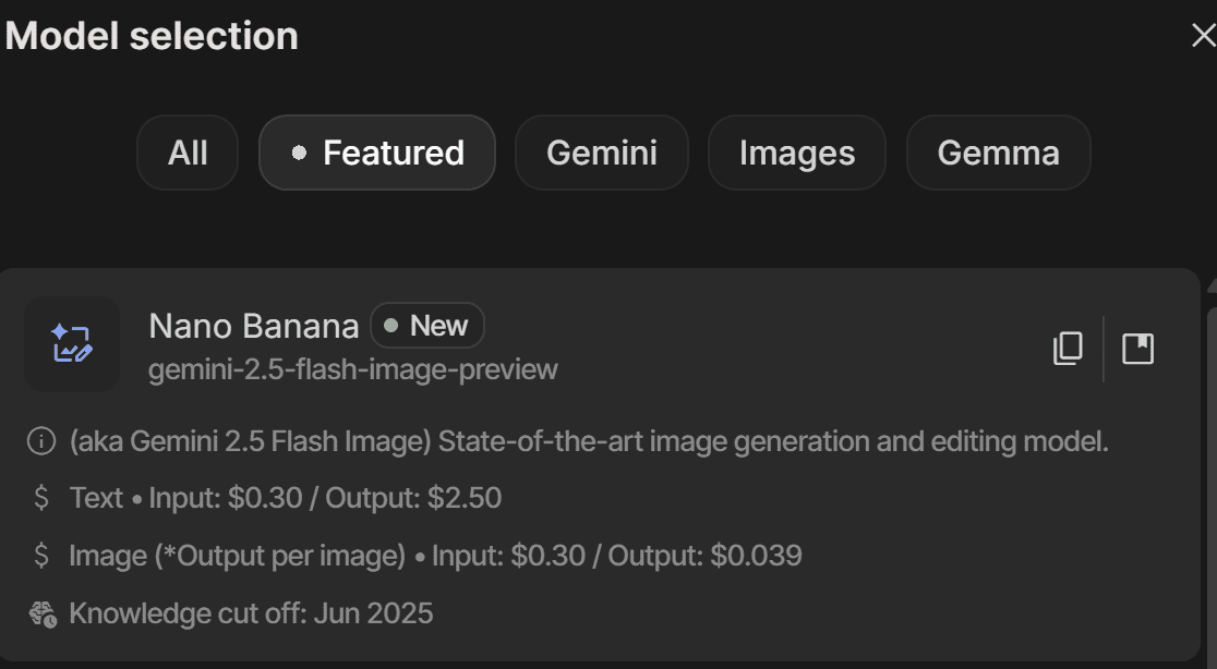
# Testing the Nano-Banana Model
To follow this tutorial, you will need to register for a Google account and sign in to Google AI Studio. You will also need to acquire an API key to use the Gemini API, which requires a paid plan as there is no free tier available.
If you prefer to use the API with Python, make sure to install the Google Generative AI library with the following command:
Once your account is set up, let’s explore how to use the nano-banana model.
First, navigate to Google AI Studio and select the Gemini-2.5-flash-image-preview model, which is the nano-banana model we will be using.
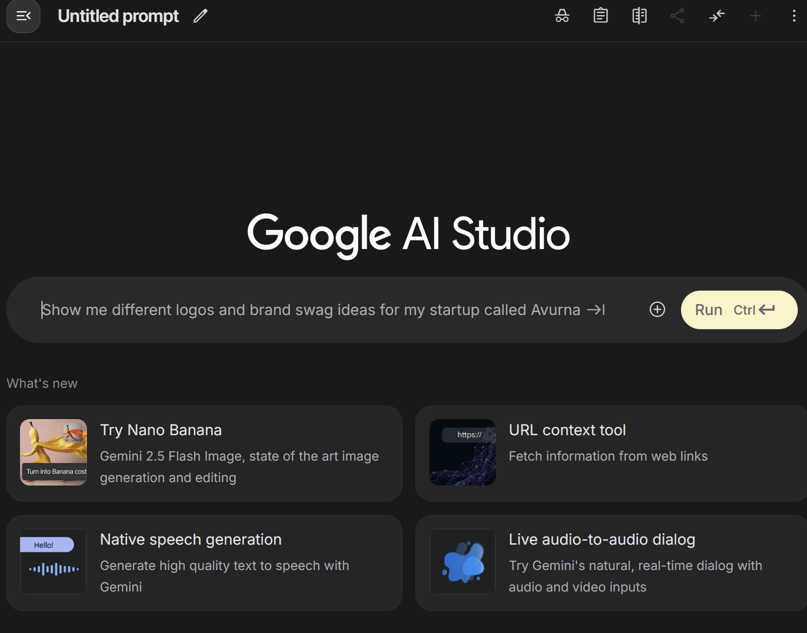
With the model selected, you can start a new chat to generate an image from a prompt. As Google suggests, a fundamental principle for getting the best results is to describe the scene, not just list keywords. This narrative approach, describing the image you envision, typically produces superior results.
In the AI Studio chat interface, you’ll see a platform like the one below where you can enter your prompt.
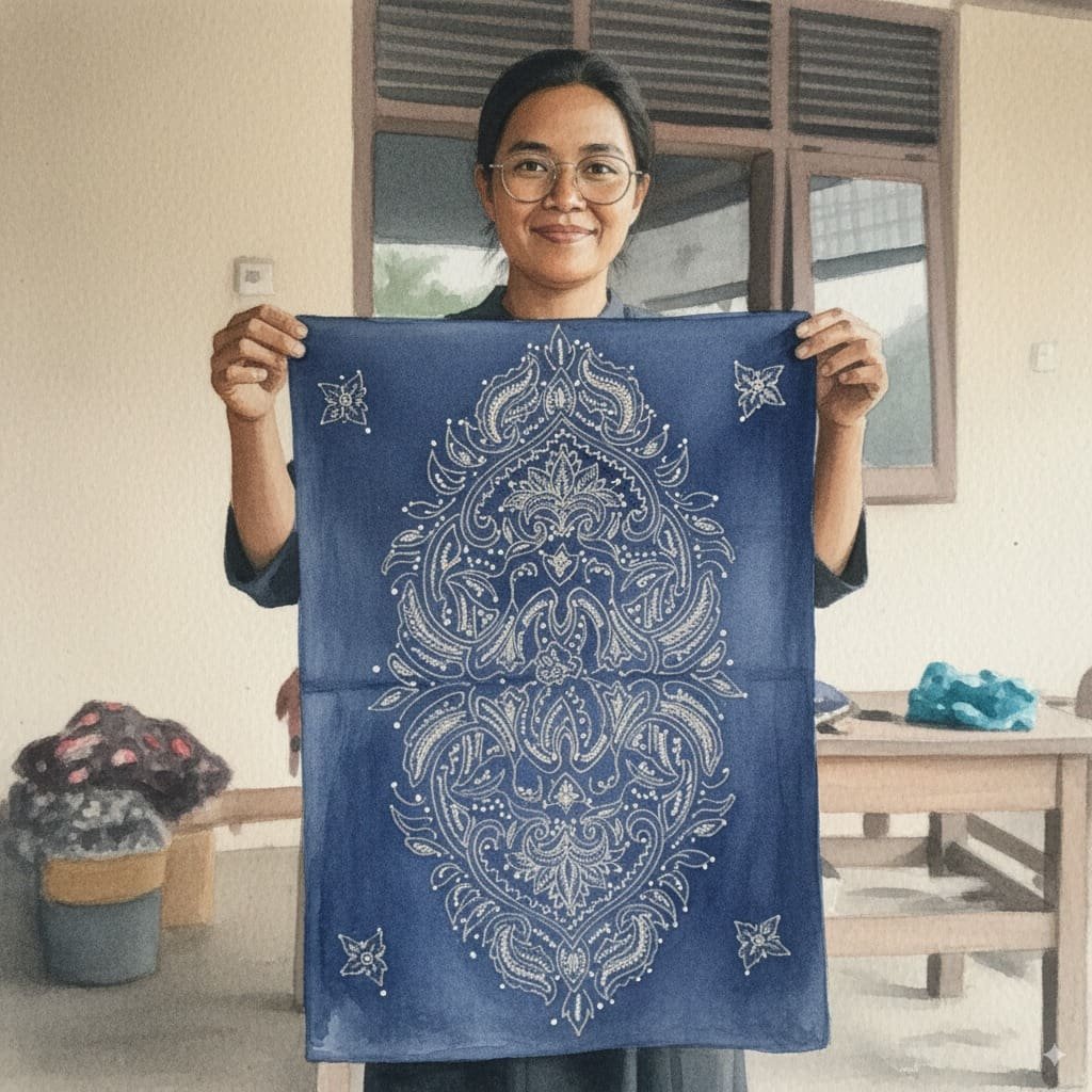
We will use the following prompt to generate a photorealistic image for our example.
A photorealistic close-up portrait of an Indonesian batik artisan, hands stained with wax, tracing a flowing motif on indigo cloth with a canting pen. She works at a wooden table in a breezy veranda; folded textiles and dye vats blur behind her. Late-morning window light rakes across the fabric, revealing fine wax lines and the grain of the teak. Captured on an 85 mm at f/2 for gentle separation and creamy bokeh. The overall mood is focused, tactile, and proud.
The generated image is shown below:

As you can see, the image generated is realistic and faithfully adheres to the given prompt. If you prefer the Python implementation, you can use the following code to create the image:
from google import genai
from google.genai import types
from PIL import Image
from io import BytesIO
from IPython.display import display

# Replace 'YOUR-API-KEY' with your actual API key
api_key = 'YOUR-API-KEY'
client = genai.Client(api_key=api_key)

prompt = "A photorealistic close-up portrait of an Indonesian batik artisan, hands stained with wax, tracing a flowing motif on indigo cloth with a canting pen. She works at a wooden table in a breezy veranda; folded textiles and dye vats blur behind her. Late-morning window light rakes across the fabric, revealing fine wax lines and the grain of the teak. Captured on an 85 mm at f/2 for gentle separation and creamy bokeh. The overall mood is focused, tactile, and proud."

response = client.models.generate_content(
    model="gemini-2.5-flash-image-preview",
    contents=prompt,
)

image_parts = [
    part.inline_data.data
    for part in response.candidates[0].content.parts
    if part.inline_data
]

if image_parts:
    image = Image.open(BytesIO(image_parts[0]))
    # image.save('your_image.png')
    display(image)
If you provide your API key and the desired prompt, the Python code above will generate the image.
We have seen that the nano-banana model can generate a photorealistic image, but its strengths extend further. As mentioned previously, nano-banana is particularly powerful for image editing, which we will explore next.
Let’s try prompt-based image editing with the image we just generated. We will use the following prompt to slightly alter the artisan’s appearance:
Using the provided image, place a pair of thin reading glasses gently on the artisan’s nose while she draws the wax lines. Ensure reflections look realistic and the glasses sit naturally on her face without obscuring her eyes.
The resulting image is shown below:

The image above is identical to the first one, but with glasses added to the artisan’s face. This demonstrates how nano-banana can edit an image based on a descriptive prompt while maintaining overall consistency.
To do this with Python, you can provide your base image and a new prompt using the following code:
from PIL import Image

# This code assumes 'client' has been configured from the previous step
base_image = Image.open('/path/to/your/photo.png')
edit_prompt = "Using the provided image, place a pair of thin reading glasses gently on the artisan's nose..."


response = client.models.generate_content(
    model="gemini-2.5-flash-image-preview",
    contents=[edit_prompt, base_image])
Next, let’s test character consistency by generating a new scene where the artisan is looking directly at the camera and smiling:
Generate a new and photorealistic image using the provided image as a reference for identity: the same batik artisan now looking up at the camera with a relaxed smile, seated at the same wooden table. Medium close-up, 85 mm look with soft veranda light, background jars subtly blurred.
The image result is shown below.

We’ve successfully changed the scene while maintaining character consistency. To test a more drastic change, let’s use the following prompt to see how nano-banana performs.
Create a product-style image using the provided image as identity reference: the same artisan presenting a finished indigo batik cloth, arms extended toward the camera. Soft, even window light, 50 mm look, neutral background clutter.
The result is shown below.

The resulting image shows a completely different scene but maintains the same character. This highlights the model’s ability to realistically produce varied content from a single reference image.
Next, let’s try image style transfer. We will use the following prompt to change the photorealistic image into a watercolor painting.
Using the provided image as identity reference, recreate the scene as a delicate watercolor on cold-press paper: loose indigo washes for the cloth, soft bleeding edges on the floral motif, pale umbers for the table and background. Keep her pose holding the fabric, gentle smile, and round glasses; let the veranda recede into light granulation and visible paper texture.
The result is shown below.
The image demonstrates that the style has been transformed into watercolor while preserving the subject and composition of the original.
Lastly, we will try image fusion, where we add an object from one image into another. For this example, I’ve generated an image of a woman’s hat using nano-banana:

Using the image of the hat, we will now place it on the artisan’s head with the following prompt:
Move the same woman and pose outdoors in open shade and place the straw hat from the product image on her head. Align the crown and brim to the head realistically; bow over her right ear (camera left), ribbon tails drifting softly with gravity. Use soft sky light as key with a gentle rim from the bright background. Maintain true straw and lace texture, natural skin tone, and a believable shadow from the brim over the forehead and top of the glasses. Keep the batik cloth and her hands unchanged. Keep the watercolor style unchanged.
This process merges the hat photo with the base image to generate a new image, with minimal changes to the pose and overall style. In Python, use the following code:
from PIL import Image

# This code assumes 'client' has been configured from the first step
base_image = Image.open('/path/to/your/photo.png')
hat_image = Image.open('/path/to/your/hat.png')
fusion_prompt = "Move the same woman and pose outdoors in open shade and place the straw hat..."

response = client.models.generate_content(
    model="gemini-2.5-flash-image-preview",
    contents=[fusion_prompt, base_image, hat_image])
For best results, use a maximum of three input images. Using more may reduce output quality.
That covers the basics of using the nano-banana model. In my opinion, this model excels when you have existing images that you want to transform or edit. It’s especially useful for maintaining consistency across a series of generated images.
Try it for yourself and don’t be afraid to iterate, as you often won’t get the perfect image on the first try.
# Wrapping Up
Gemini 2.5 Flash Image, or nano-banana, is the latest image generation and editing model from Google. It boasts powerful capabilities compared to previous image generation models. In this article, we explored how to use nano-banana to generate and edit images, highlighting its features for maintaining consistency and applying stylistic changes.
I hope this has been helpful!
Cornellius Yudha Wijaya is a data science assistant manager and data writer. While working full-time at Allianz Indonesia, he loves to share Python and data tips via social media and writing media. Cornellius writes on a variety of AI and machine learning topics.

Image by Editor | ChatGPT
Becoming a machine learning engineer is an exciting journey that blends software engineering, data science, and artificial intelligence. It involves building systems that can learn from data and make predictions or decisions with minimal human intervention. To succeed, you need strong foundations in mathematics, programming, and data analysis.
This article will guide you through the steps to start and grow your career in machine learning.
# What Does a Machine Learning Engineer Do?
A machine learning engineer bridges the gap between data scientists and software engineers. While data scientists focus on experimentation and insights, machine learning engineers ensure models are scalable, optimized, and production-ready.
Key responsibilities include:
- Designing and training machine learning models
- Deploying models into production environments
- Monitoring model performance and retraining when necessary
- Collaborating with data scientists, software engineers, and business stakeholders
# Skills Required to Become a Machine Learning Engineer
To thrive in this career, you’ll need a mix of technical expertise and soft skills:
- Mathematics & Statistics: Strong foundations in linear algebra, calculus, probability, and statistics are crucial for understanding how algorithms work.
- Programming: Proficiency in Python and its libraries is essential, while knowledge of Java, C++, or R can be an added advantage
- Data Handling: Experience with SQL, big data frameworks (Hadoop, Spark), and cloud platforms (AWS, GCP, Azure) is often required
- Machine Learning & Deep Learning: Understanding supervised/unsupervised learning, reinforcement learning, and neural networks is key
- Software Engineering Practices: Version control (Git), APIs, testing, and Machine learning operations (MLOps) principles are essential for deploying models at scale
- Soft Skills: Problem-solving, communication, and collaboration skills are just as important as technical expertise
# Step-by-Step Path to Becoming a Machine Learning Engineer
// 1. Building a Strong Educational Foundation
A bachelor’s degree in computer science, data science, statistics, or a related field is common. Advanced roles often require a master’s or PhD, particularly in research-intensive positions.
// 2. Learning Programming and Data Science Basics
Start with Python for coding and libraries like NumPy, Pandas, and Scikit-learn for analysis. Build a foundation in data handling, visualization, and basic statistics to prepare for machine learning.
// 3. Mastering Core Machine Learning Concepts
Study algorithms like linear regression, decision trees, support vector machines (SVMs), clustering, and deep learning architectures. Implement them from scratch to truly understand how they work.
// 4. Working on Projects
Practical experience is invaluable. Build projects such as recommendation engines, sentiment analysis models, or image classifiers. Showcase your work on GitHub or Kaggle.
// 5. Exploring MLOps and Deployment
Learn how to take models from notebooks into production. Master platforms like MLflow, Kubeflow, and cloud services (AWS SageMaker, GCP AI Platform, Azure ML) to build scalable, automated machine learning pipelines.
// 6. Getting Professional Experience
Look for positions like data analyst, software engineer, or junior machine learning engineer to get hands-on industry exposure. Freelancing can also help you gain real-world experience and build a portfolio.
// 7. Keeping Learning and Specializing
Stay updated with research papers, open-source contributions, and conferences. You may also specialize in areas like natural language processing (NLP), computer vision, or reinforcement learning.
# Career Path for Machine Learning Engineers
As you progress, you can advance into roles like:
- Senior Machine Learning Engineer: Leading projects and mentoring junior engineers
- Machine Learning Architect: Designing large-scale machine learning systems
- Research Scientist: Working on cutting-edge algorithms and publishing findings
- AI Product Manager: Bridging technical and business strategy in AI-driven products
# Conclusion
Machine learning engineering is a dynamic and rewarding career that requires strong foundations in math, coding, and practical application. By building projects, showcasing a portfolio, and continuously learning, you can position yourself as a competitive candidate in this fast-growing field. Staying connected with the community and gaining real-world experience will accelerate both your skills and career opportunities.
Jayita Gulati is a machine learning enthusiast and technical writer driven by her passion for building machine learning models. She holds a Master’s degree in Computer Science from the University of Liverpool.

TCS has entered into a strategic partnership with the IIT-Kanpur to address one of India’s most pressing challenges: sustainable urbanisation.
IIT-K’s Airawat Research Foundation and TCS will leverage AI and advanced technologies to tackle the challenge of urban planning at scale.
The foundation was set up by IIT Kanpur with support from the education, housing and urban affairs ministries, to rethink the way cities are built.
According to an official release, the partnership aims to tackle the challenges of rapid urbanisation, such as urban mobility, energy consumption, pollution management, and governance, which are exacerbated when cities expand without adequate planning.
Notably, the United Nations has flagged these issues, projecting that by 2050, 68% of the world’s population will live in urban centres, driving a significant demographic shift from rural to urban areas.
Manindra Agrawal, director at IIT Kanpur, said, “…By harnessing AI, data-driven insights, and systems-based thinking, we aim to transform our urban spaces into resilient, equitable, and climate-conscious ecosystems.”
He said that the foundation’s collaboration with TCS is advancing this vision by turning India’s urban challenges into global opportunities for innovation.
The company informed that it will enable rapid ‘what-if’ scenario modelling, empowering urban planners to simulate and evaluate interventions before implementation.
The long-term goal is to build cities that are resilient, equitable, and ecologically balanced, while deepening the understanding of and modelling the complex interactions between human activity and climate change, it said.
In the statement, Dr Harrick Vin, CTO, TCS, said, “…TCS will bring our deep capabilities in AI, remote sensing, multi-modal data fusion, digital twin, as well as data and knowledge engineering technologies to help solve today’s urban challenges and anticipate the needs of tomorrow’s cities.”
Sachchida Nand Tripathi, project director at Airawat Research Foundation, said, “At Airawat, we are not just deploying AI tools, we are building a global model of sustainable urbanisation rooted in Indian innovation.”
Through this collaboration, Tripathi said, “We would address the country’s most complex urban challenges, using AI-driven modelling, satellite and sensor networks, and digital platforms to improve air quality, forecast floods, optimise green spaces, and strengthen governance.”
The post TCS and IIT-Kanpur Partner to Build Sustainable Cities with AI appeared first on Analytics India Magazine.
-

 Business5 days ago
The Guardian view on Trump and the Fed: independence is no substitute for accountability | Editorial
-
Tools & Platforms3 weeks ago
Building Trust in Military AI Starts with Opening the Black Box – War on the Rocks
-

 Ethics & Policy1 month ago
SDAIA Supports Saudi Arabia’s Leadership in Shaping Global AI Ethics, Policy, and Research – وكالة الأنباء السعودية
-

 Events & Conferences4 months ago
Journey to 1000 models: Scaling Instagram’s recommendation system
-

 Jobs & Careers2 months ago
Mumbai-based Perplexity Alternative Has 60k+ Users Without Funding
-

 Education2 months ago
VEX Robotics launches AI-powered classroom robotics system
-

 Funding & Business2 months ago
Kayak and Expedia race to build AI travel agents that turn social posts into itineraries
-

 Podcasts & Talks2 months ago
Happy 4th of July! 🎆 Made with Veo 3 in Gemini
-

 Podcasts & Talks2 months ago
OpenAI 🤝 @teamganassi
-

 Education2 months ago
AERDF highlights the latest PreK-12 discoveries and inventions